|
...Continued from Page 13.

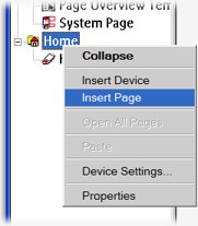
Right-clicking menu options. |
Creating your layout: 101.
Generally there are three or four ways to get anything done in ProntoProEdit NG. The first is by using the text menu system: if you want to add a device you can go to “Insert -> Device”. The second and usually quicker method is via the context-sensitive menu, accessed by right-clicking over the area where you want something done: right-clicking over the “Home” device displays several options such as “Insert new device” and “Insert new page”. The third method is with a keyboard shortcut, while the fourth is by double-clicking on an item, which usually displays a settings screen.
For example, all new devices are labelled “New Device” by default. Don’t like that? Then there are four ways to rename it. First is the “Edit -> Label” menu function, the second way is the right-click “Label” option, while the third is by pressing [F2]. All of these lead to the fourth double-click option, the “Label” tab under the “Device Properties” box.
The “Properties” window is the main multi-purpose section where all elements – the remote, a device, a page, a button or a panel – are customized. Its contents change depending on the item being edited, ranging from hard button functions to macro building, and from button graphic assignments to text size and color. Because its large size tends to occupy a major portion of the screen, most users don’t immediately discover that the Properties window is really a free-floating box that doesn’t need to be opened and closed all the time – thus the lack of [OK] and [Cancel] buttons at the bottom. Leave it open and simply click on a new object to instantly edit its contents. The problem is seeing past the box to find something to click on... a high resolution screen setting is required for this to be practical.
New devices are initially created without pages. Right-clicking over the device and selecting “Insert New Page” a few times solves that need quickly. To view the contents of a page, double-click its line in the device tree to make it appear on the right side of a screen. Multiple pages from any number of devices can be shown at once, and the order in which they are displayed can be changed by dragging it to the preferred position.

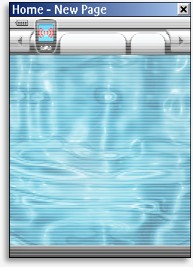
New pages always show a lightened system area preview. |
The first thing you’ll notice is that the supposedly new page isn’t completely blank. It shows a greyed out version of whatever items have been placed on the “System Page” – the static user interface. You can put new objects overtop of these items if you wish, or use the preview as a layout guideline. Unfortunately there is no way to hide the system preview, or make it completely opaque, so the only way to truly see how a particular screen will look is in the simulator.
Building blocks.
All screens on the Pronto are made up of two types of objects: buttons and panels (previously known as frames). The difference between the two is that buttons have commands, while panels are static elements that don’t serve an operational purpose – such as backgrounds, text, or decorative pictures.
The usual place to find buttons and panels is in the Gallery, a section that had first been redesigned in ProntoEdit NG. Instead of containing a simple list of “remote-like” pages on which the user has placed buttons and frames, the gallery is now a full interface that stores objects in different customizable categories.
| 
