|
...Continued from Page 11.
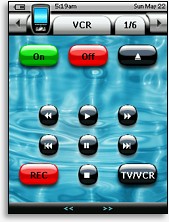 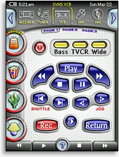
An example of how screens can be customized with PPENG (original on the left). |
Although ProntoProEdit NG is quite similar to the original ProntoProEdit application, Philips has rewritten the program from scratch – which might explain why the download is nearly 8 times bigger than ProntoProEdit 3.4. ProntoProEdit NG is very similar to the TSU3000’s software, ProntoEdit NG, but the two are not cross-compatible – you must use the version designed specifically for your remote. ProntoProEdit NG can open any TSU3000 PCF file, but ProntoEdit NG cannot similarly open TSU7000 files.
As the warning label on the USB cable cautions, install the software before connecting the remote to your PC – unlike the TSU3000, a Windows driver is necessary for the TSU7000. ProntoProEdit NG is simple to install – insert the CD, pick a directory and away it goes. After installation the program is associated with the new PCF file format, files that contain a complete copy of your remote’s configuration. Much like saving over a Microsoft Word document, when you download a file to the remote everything that was there previously is overwritten.
For this review we’re using ProntoProEdit NG 2.0.
Welcome to your new hobby.
The first time ProntoProEdit NG is launched, a small window appears asking you to pick between the North American TSU7000 and European RU980 models. After that the screen turns grey. To actually start working on anything go to the “File” menu, where options will be available for creating a new file, opening existing files, along with a quick-load list of previously accessed files at the bottom that will populate over time. Two PCF files can also be merged together. Although it’s possible to mine the huge selection of available Pronto CCF files through an “import” command, doing so will not take advantage of the TSU7000’s two main improvements, a larger editable screen and advanced color capabilities. Gone from previous ProntoProEdit NG versions is the “Welcome” screen, as well as the option to pick between “Advanced” and “Standard” editing modes.
After choosing to create a new file, ProntoProEdit NG displays a large, white, and rather empty window. This is the main editing interface. Along the top of the screen is a standard text menu bar – File, Edit, View, Insert, Layout, Tools, Window and Help. Below that is an iconic toolbar with 18 quick links to oft-used features such as save, download to remote, undo, emulate and gallery. Below that, if they’re enabled from the “View” menu, are two further toolbars: “Layout” with 20 buttons for zooming (50, 100, 200, 300 or 400 percent), grids, order, grouping and alignment, and “Object” with 16 selections to create new buttons, panels and various system items (only two of those will get regular use).

The Layout & Object toolboxes. |
ProntoProEdit NG supports the simultaneous editing of multiple PCF files, so several resizable windows can be visible at once. Each file view is subdivided into two portions. The smaller left side is the navigation tree, where devices, pages and system properties reside. The larger right half is for page previews and is where all actual layout work is done. Many pages can be shown at once, but exactly how many can be seen depends on your monitor’s resolution.
Running along the bottom of the program is a status bar for program readiness (which almost always shows “Ready”), an advanced/normal mode icon, plus space for object position coordinates and dimensions. Other space fillers on the bar are keyboard num lock, caps lock and scroll lock icons, but gone is the superfluous date and time from the TSU3000’s software which duplicated the omnipresent Windows clock a half inch higher. Despite some usability enhancements in version 2.0, ProntoProEdit NG’s interface is still best described as “functional” – and a long way from “elegant”. I would love to see a complete rethink of how ProntoProEdit works, which might include dockable toolbars and a tabbed always-visible button properties bar for commands and bitmaps.
|
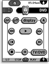
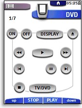
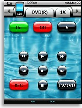
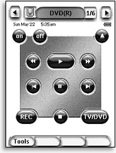
The progression of the Pronto's default user interface design. Starting clockwise from the top left: the original Pronto TS-1000, the color ProntoPro TSU6000, the Pronto NG TSU3000, and finally the color ProntoPro NG TSU7000.
|
| 
