|
The user editable portion of the screen is 64 by 90 pixels. For images to correspond to the physical buttons correctly they should be no larger than 64 by 16 pixels to cover both columns, or 32 by 16 pixels for a single column, with each row separated by two pixels. Any images smaller than this (such as a thin dividing line between rows) did not work well in my tests as the remote's software made a failed attempt to pad them larger.
The image gallery.
MX-950 Editor features a floating image gallery window to manage all of your bitmaps, which can be in BMP or JPG format (although the latter type is not particularly suitable considering the Aurora's screen). This gallery, unlike the rest of MX-950 Editor, seems to have had little thought put into its design and poses as much hindrance as it does help.
First, resizing the window does not rearrange the icons inside. The default window size was only one column of images wide, so after the list became uncomfortably long I decided to widen it to three columns. The single long column of thumbnails remained. New images, on the other hand, were indeed added to the top of the empty second and third columns... unless I was scrolled all the way to the bottom, where they were instead added halfway up the list. Second, there's no way to sort images: they only appear in the order added, so if you have a large number of bitmaps it will be difficult to determine exactly where anything is or even if there are duplicates.

Positioning bitmaps.
|
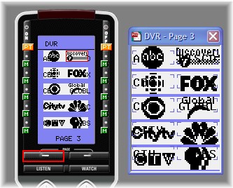
Positioning images in MX-950 editor is also not exactly easy - the main Simulator's screen does not show graphics in a proportional manner, so it is useless for determining where an image will actually show up on the finished remote. For that, you need to enable the "Both Simulated and Page" option from the View menu. Enabling the Page option will open a new floating window displaying a screen preview every time a page number is double-clicked on in the tree menu. This window, unlike the Simulator's preview, does display graphics [mostly] correctly... but can't be used to add or position images, tasks that must still be done on the Simulator's preview. Sounds complicated? It is!
No snap-to grid or coordinate display is provided and, despite what both previews show, images will always appear overtop of text so there's no way to simply add a box around a label as everything under that box will have to be recreated.
Awkward though all of this may sound, these sorts of nuances are nonetheless easy to work around or ignore once you know about them. And, thinking in a "glass is half full" frame of mind, the MX-950's restricted screen resolution does help keep the amount of the time it takes to complete an entire setup to a minimum, since there really isn't much of a need to create customized images, something that can take a lot of work.
| 
