|
 |
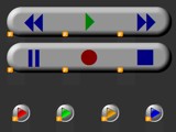 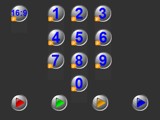
For: URC MX-3000 By: Andrew Fox | Andrew Fox's MX-3000 Totally original layout using "LED" style buttons. Thanks to FreeButtons.com for their permission to use their work in this format. Layout relies on page jumps and animations to give the effect of buttons lighting up. Animated powering up and down and a animated "cleaning mode" page. |
|
 |
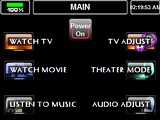 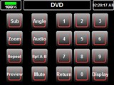
For: URC MX-3000 By: John Whytsell | Black on Black With the exception of the Main Page buttons, the buttons are all original. I use alot of variables to show buttons green or red for on or off. Also used variables to "know" device power states. |
|
 |
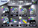 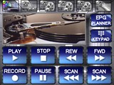
For: URC MX-3000 By: Matt Elton | Both Hands on the Wheel! All new graphics 90% made by my amateur hands. Some graphics on the home window and the device swap buttons were modded from the TSU9600 software. Learning with variables. Working indicators on the Sky RF and Sky TAG pages. |
|
 |
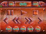 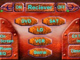
For: URC MX-3000 By: Casey Luchsinger | Casey Luchsinger's Design This is a file containing completley customized layout graphics for an HTM MX-3000. It contains backgrounds, buttons, animations, battery meter, and a generic template, for design ideas. |
|
 |
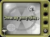 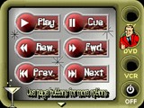
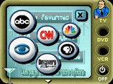
For: URC MX-3000 By: Robbie Clark | Contest Entry # 1: Test Patternz Grand Prize Winner! (Part 1 of 3)
What makes my design unique? Well as a Crestron GUI developer, I pride myself on ‘ease-of-use’ being the foremost factor in creating a new design with ‘fun’ being a close second. I believe this entry reflects that. You will notice that all macros (TV, DVD, VCR, and OFF) are available on every page and in the same place, so there is little ‘hunting around’ when ready to turn the system on. Since all devices used have discrete or ‘anchored’ codes to turn them on or off, there is no need for an ‘ON’ button anywhere, just press the option you’d like to enjoy and the remote does the rest. This lends itself well to the already easy to use MX3000 which always has volume, channel, and other such buttons conveniently always in the same place.After you select a macro you will notice the two dancing fellows telling you to please stand by. This helps the customer understand that the remote is ‘busy’ and the option will soon be displayed. This page also serves people who might be using ‘line of sight’ IR directly from the MX3000…this page essentially tells you how long to hold the remote pointed at the equipment. Please... (more) |
|
 |
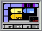 
For: URC MX-3000 By: Robbie Clark | Contest Entry # 2: Star Frontier Grand Prize Winner! (Part 2 of 3)
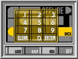
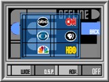
This is a cool design which emulates a popular TV program (I’ll let you guess which one, here’s a hint, ‘Something’ Trek). The transitions on this panel are fun, with transporter effects fading between device and main menu, and buttons which slide across the screen to open and close additional pages. The sounds and look and feel conjure up feelings that only a true trekkie could comprehend…you even get to shoot down Klingons if that is to your liking.This entry is more ‘form’ over ‘function’. I could just as well have titled it ‘Fun with Animated Gifs’. Though designed with ease-of-use in mind (oversimplified button choices, large colorful graphics) it represents more of a fun approach to controlling audio and video components. Under the advanced setup page, the code needed to enter is 911. |
|
 |
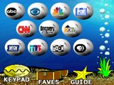
For: URC MX-3000 By: Robbie Clark | Contest Entry # 3: Bubblez Grand Prize Winner! (Part 3 of 3)
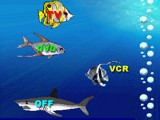
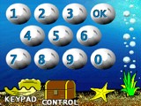
This entry started out as a way to amuse my 2 year old daughter. I wanted something with plenty of colors and movement, and what do I end up with but a remote full of bubbles and fish? The transitions between pages on this one are also fun, the theme of course being 'bubbles'. There are also plenty of animated fish and underwater life. The best feature I think is the animation tied to the OFF macro (please check it out) … this is the soft of thing I just can’t do with Crestron :) It’s a simple remote, but still pretty cool (sometimes the simpler the better).This entry is also more ‘fun’ than ‘functional’ but does offer the same simplified level of control that I generally give to my customers. It offers fun bubble-filled transitions from page to page (again to the liking of my toddler who isn’t even allowed to play with the remote anyway). The pages are colorful with no shortage of fish, bubbles, and seaweed to grab your attention. Under the advanced setup page, the code needed to enter is 911. |
|
 |
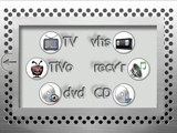 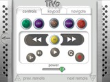
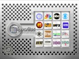
For: URC MX-3000 By: Dave Beck | Contest Entry # 4: Metal MX-3000 Second Place Winner!
Here's my entry for the MX-3000 design contest. I tried to take advantage of the animation capabilities of the remote while drawing off of the unique industrial, mechanical feel I originated in my PCF design "Perforated Metal." I wanted to make it feel as if the interface was composed of materials that would actually be used to create an RC device. Almost all of the buttons have unique static and selected states. I think there is a sense of tangible space in my design that sets it apart without making it too flashy and a directness in design which makes it clear and easy to use. I hope you enjoy using the interface as much as I did creating it. |
|
 |
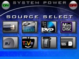 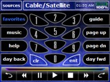
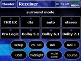
For: URC MX-3000 By: Noel Blackman | Contest Entry # 5: Black & Blue Second Place Winner!
This template was specifically designed to be easy to use while keeping an intuitive, easy to understand layout. The most common functions are on the main page and the template will walk you to the next step. The design can be easily reconfigured to suit just about anyone's equipment.It also features a battery meter on every source page with charging confirmation and shortcuts to the most commonly used pages for each device. All device pages have a direct shortcut to the source select page, this keeps almost every page only two button pushes away. If you have a first generation MX3000 with 32MB of memory, there should be plenty of memory space on the remote for Bracken's DMX3000 (DVD changer software) and over 400 DVD covers. |
|
 |
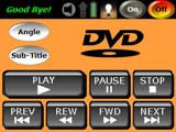 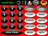
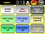
For: URC MX-3000 By: Stephen Bond | Contest Entry # 6: Simplified Elegance Second Place Winner!
I designed this layout to provide an extremely user-friendly remote which didn’t make too many compromises in functionality. I created a series of buttons which could easily be reused in other projects. I also experimented with colors which were easy to read, and easy to distinguish. Each device has its own color palette. This allows another identifying characteristic for each component and reduces the possibility of confusion. There is also a sense of consistency and unity throughout the remote. This file also makes use of variables, offers feedback wherever possible, sound and much more. |
|
 |
More Original Design Systems: [ < Back | Next > ]
Return to the Complete System Files index. |

